
What we found
80% of participants
entered a high-risk driving moment while adding a stop mid-route
60% slowed down
or stopped their vehicle to complete the interaction safely
20% felt dissatisfied
yet 80% showed visible safety concerns, a critical gap between felt and actual risk
Problem
How well does Apple Maps support users when navigation becomes stressful, time-sensitive, and multitasking-heavy?
User Group
Because Apple Maps' familiarity and time pressure can change how drivers interact with navigation, we divided participants into four groups. This helped us compare behavior across low-pressure use and high-stakes, time-sensitive driving contexts.
Experienced

Power Driver
Knows the app well but needs to act fast. Prioritizes speed over exploration.

Savvy Explorer
Familiar with the app and unhurried. Explores features more calmly and thoroughly.

Highest risk ⚠️
Stressed Learner
Newest to the app and under real time pressure. Needs fast, clear guidance while managing driving stress.

Casual Newcomer
Occasional user with time to explore. Most likely to notice and clearly report interface flaws.
Method
Mixed-method usability study, conducted in-lab using an iPhone and a fixed driving simulator.


Core Tasks
Tasks were designed to reflect the most frequent and high-stakes Apple Maps interactions identified across all 4 user groups.
🔍
TASK 01
Search for a restaurant with group-specific filter
📍
TASK 02
Save a work location and search for a gas station
🗺️
TASK 03
Navigate to a destination while reviewing traffic and ETA
⚠️
TASK 04 — CRITICAL
Add a Costco stop mid-route while actively driving
🧭
TASK 05
Free exploration of Apple Maps features
Key Findings
Finding 01
🟠 High
Filter UI is hidden and non-obvious
4 of 5 participants failed to locate the filter on first attempt. The icon-only control had no label and was placed away from the expected search area.
Usability Principles Violated
· Visibility of system status
· Recognition over recall

Figure 8. The Apple Maps restaurant search screen showing the filter icon (circled). No label or tooltip is visible.
Recommendation 01
Increase filter discoverability with label.
Add a text label ("Filter") beneath the filter icon in the restaurant search toolbar, and expose the most common filter (dietary type) as a one-tap chip in the results list. Icon-only controls require learnability that first-time users don't have.
Finding 02
🔴 Critical
Mid-route stop added with no visible confirmation
3 of 5 participants were uncertain if the stop was added. No modal, toast, or audio confirmation followed "Add Stop" Two users reattempted, creating duplicate waypoints.
Usability Principles Violated
· Visibility of system status · Error prevention


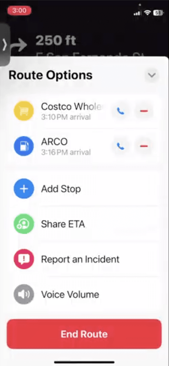
Figure 16. Task 4 flow: (A) Costco selected, (B) navigation resumes with no confirmation, (C) Route Options where stop appears later.
Recommendation 02
Add visual and audio confirmation when a stop is added mid-route
After the user taps "Add Stop," display a brief overlay banner ("Costco added — ETA +12 min") and play a confirmation chime. This eliminates the uncertainty that caused 3 of 5 participants to reattempt the action and create duplicate waypoints. The banner should autodismiss after 3 seconds.
Finding 03
🟠 High
Route customization requires too many steps while driving
All 5 participants struggled to reach Route Options mid-drive, which required 3–4 taps through buried menus, raising cognitive load and safety risk.
Usability Principles Violated
· Excessive interaction steps
· High cognitive load from multi-step access while driving

Figure 13. Route Options panel — accessible only after 3–4 taps through navigation menus.
Recommendation 03
Allow route changes without breaking the navigation flow
Expose a persistent "Route" button on the active navigation banner that opens a slide-up panel for route options without exiting turn-by-turn navigation. The current flow forces users to exit navigation entirely to change route preferences, restarting guidance from scratch.
Finding 04
🔴 Critical
No drag-and-drop stop reordering disrupts multi-stop trip planning
P1 and P4 encountered friction when rearranging multiple stops with no drag-and-drop support, they had to manually delete and re-add each stop to change the route order. While not a critical blocker, it interrupted planning flow and was casually noted as something they would change.
Usability Principles Violated
· Increased working memory load
· Lack of direct manipulation affordance

P1 and P4 attempting to reorder stops in Route Options — only deletion was possible, not drag-and-drop reordering.
Suggestion 04
Enable drag-and-drop stop reordering in Route Options
Add drag handles to each stop row in the Route Options list so users can reorder destinations by dragging — eliminating the need to delete and re-add stops manually. This reduces working memory demand and aligns with the direct manipulation patterns users already expect from mobile list interfaces.
REFLECTION
What I'd do differently
· Recruit a larger sample (10–12 participants) to detect less obvious usability patterns.
· Add eye-tracking to quantify visual attention cost per interaction, and more meaningful than task-completion time in a driving context.
· Include a think-aloud calibration step at session start; participants often went quiet during navigation tasks, reducing behavioral data richness.
· Use a real moving vehicle or higher-fidelity simulator to better approximate real-world distraction levels.
FULL REPORT
Apple Maps Usability Study
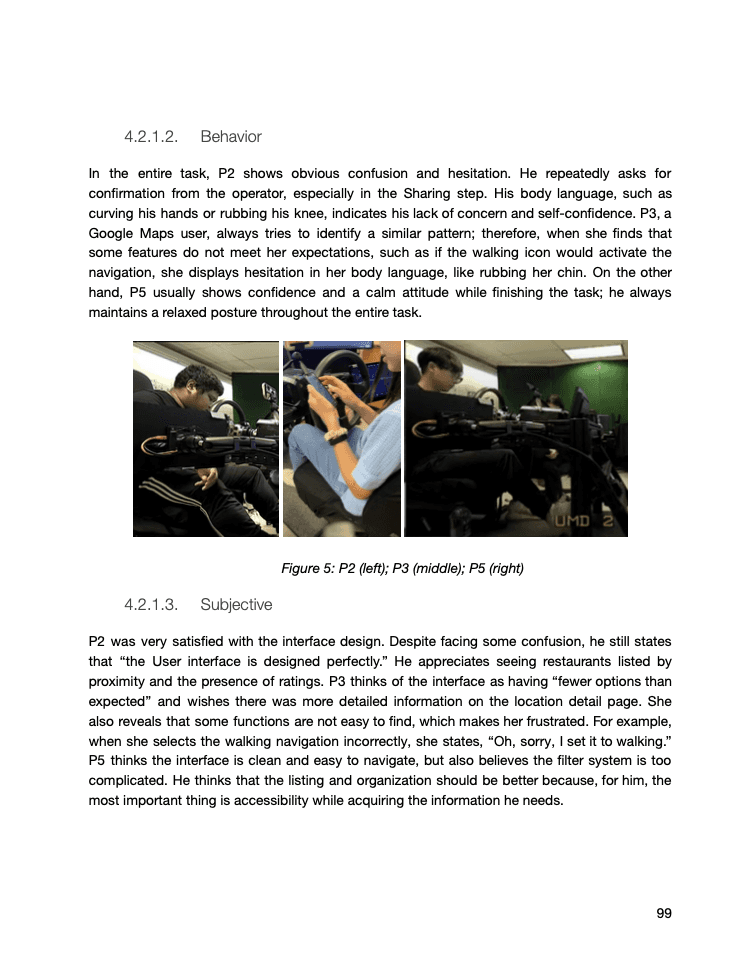
Root Causes Analyses, Behavior, Performance details


MORE CASE STUDIES

